Lead Design Systems Engineer at Condé Nast

I‘m a seasoned web designer and front-end developer with a specialized focus on developing comprehensive design systems. Here, I‘ve assembled a showcase of projects that reflect my commitment to marrying form with function, creating user-centric designs that drive business success.

Verso: Condé Nast’s Global Design System

One of my significant achievements was creating Verso, Condé Nast‘s global design system. This system was meticulously designed to scale across a range of iconic brands such as Vogue, The New Yorker, WIRED, Vanity Fair, Bon Appétit, and Pitchfork. By integrating a tokenized approach, I ensured that despite the diverse brand aesthetics, there could be a unified yet flexible design framework that upholds individual brand identities.

Token-driven design

In building design systems, I rely heavily on a token-driven approach, which allows every design element to be defined by specific tokens. For example, in the card components that I developed, I annotated each color and type token to illustrate how foundational design consistency can be achieved across varied applications. This method not only streamlines the development process but also fortifies the design’s adaptability.

Card brandless12, 3, 45, 67, 89, 10
1
color.card.background
2
color.context.background
3
type.context.rubric
4
color.context.label
5
color.card.heading
6
type.card.heading
7
color.card.subheading
8
type.card.subheading
9
color.card.accreditation
10
type.card.accreditation

Multi-brand theming through design tokens

Understanding the need for brands to maintain distinct identities yet operate under a singular corporate umbrella, I engineered a solution using "Brand Identity" JSON files. This system allows each brand at Condé Nast to have its own unique design elements, tailored through the JSON file, while sharing a common structural base.

This approach not only simplifies brand differentiation but ensures that any component within our design system can connect flawlessly with different brands, enhancing both usability and brand coherence.

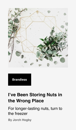
brandless card
brandless card
A brandless/white label card
not Vogue card
not Vogue card
A card from a fashion brand
not The New Yorker card
A card from a news and literary brand
not Them.us card
not Them.us card
A card from an LGBTQIA news brand

Enhancing Editorial Flexibility with Dynamic Layouts

In this design system, I emphasize empowering editors through the strategic use of design tokens and adaptable layout configurations. This approach ensures that the control over the brand‘s narrative remains firmly in the hands of those who curate it—our editors. The system I developed provides unmatched flexibility, allowing editors to fine-tune the narrative tone and customize the presentation of content to meet their vision precisely.

Whether editors are making subtle refinements or opting for more dramatic layout changes, the tools I‘ve integrated ensure each piece of content not only engages but also leaves a lasting impression on the audience. The result is a powerful platform that supports creative freedom while maintaining brand coherence across all mediums.

a screenshot of an article from The New Yorker
An article header from The New Yorker
a screenshot of an article from Pitchfork
An article header from Pitchfork
a screenshot of an article from them.us
An article header from them.us
a screenshot of an article from Vogue
An article header from Vogue

Seamless Workflow Integration between Design and Engineering

Another aspect of my work involves bridging the gap between design and engineering teams. I developed a custom Figma plugin that facilitates the export and import of brand identity files directly within the design tool. This tool translates a designer’s work into JSON files used by developers, maintaining the JSON as the "source of truth." This ensures that the web application is always aligned with the latest design specifications without any delays or discrepancies.

Custom Figma plugin to export and import brand identity files
All design tokens are expressed as JSON for the web app.
{
colors:{
consumption:{},
discovery:{},
foundation:{},
interactive:{},
palette:{}
},
typography:{
commerce:{},
consumptionEditorial:{},
discovery:{},
foundation:{},
globalEditorial:{},
utility:{}
}
}

Robust Design Options with Comprehensive Token System

This design system offers a comprehensive suite of tokens for typography, color themes, and decorative elements, providing unmatched versatility and customization options.

Color tokens are meticulously crafted to enable effortless custom coloring of every design element, ensuring a harmonious visual experience without overwhelming users with an abundance of options.

Typography tokens are thoughtfully designed to strike the perfect balance between creativity and performance. Through meticulous analysis, I‘ve developed a responsive text system that empowers designers with precise control over their typographic choices.

And the decoration tokens feature is a unique addition to this system that allows for the fine-tuning of decorative elements such as border radius and line styles. From customizing badges and borders to uploading bespoke assets for backgrounds, this innovative feature adds an extra layer of creativity to our brand sites.

sample color tokens
sample color tokens
A sampling of color tokens
sample typography tokens
A sampling of typography tokens
sample decoration tokens
A sampling of decoration tokens

Guidance and Governance through a Design System Portal

To further support and enable users within and outside our core team, I created a storefront-like site, acting as a design system portal. This platform not only provides detailed guidelines and resource accessibility but also encourages contribution and ownership across the broader team. By making the tools and elements of our design system transparent and accessible, we enhance collective creativity and ensure that our products always feel fresh, current, and connected to our users‘ needs.

a screenshot of the Verso storefront site
the Verso storefront site
a screenshot of a button component from the Verso storefront site
a button component from the Verso storefront site
a screenshot of button component variations from the Verso storefront site
variations of a button component from the Verso storefront site
a screenshot of button component code implementation from the Verso storefront site
code implementation of a button component from the Verso storefront site
a screenshot of button component usage from the Verso storefront site
details on using a button component from the Verso storefront site

As an expert in web design and front-end development, my goal is to create systems that are not just functional but also adjustable, scalable, and intuitively aligned with each brand’s ethos. I‘ve focused on ensuring that every project I handle is infused with strategic thought, precision, and a keen eye toward future needs, enabling seamless digital experiences that stand the test of time.

Looking to bring visionary design and meticulous execution to your projects? Let‘s connect and explore how we can elevate your brand together. Let‘s create something exceptional.